Animated Plots in Python with Plotly Express
- Malvik Vaghadia
- Mar 12, 2022
- 3 min read
Updated: Mar 30, 2022
In this section
The Jupyter Notebook 'Animated Plots.ipynb' which is available in Github contains the code used in this article.
What is Plotly Express
Plotly Express is built on top of the Plotly library and can create figures with just a single line of code. Plotly is free and open source.
One of the main reasons why Plotly is such a great visualization library is because it provides interactivity, beautiful aesthetics as well as a number of charting options.
Installation
Plotly Express is a built-in module from the Plotly library, so to be able to use Plotly Express you’ll need to install Plotly.
To install Plotly you can type either of the following in your terminal or command prompt:
pip install plotlyif you are using the Anaconda environment you can type
conda install plotlyYou can import Plotly Express using the following line of code:
import plotly.express as pxThe syntax for any Plotly Express chart is:
px.chart(data_frame, parameters)Refer to the official guidance from Plotly here. https://plotly.com/python/getting-started/#installation
Note: I am using Jupyter Notebook as my preferred IDE but you can use other contexts such as Google Collaboratory, Visual Studio Code or even the Python Shell. Note that some other contexts might require a compatible renderer to be able to display your charts, refer to additional guidance in this instance.
Dataset Overview
As with other libraries in Python like Seaborn, Plotly has a number of built-in sample datasets.
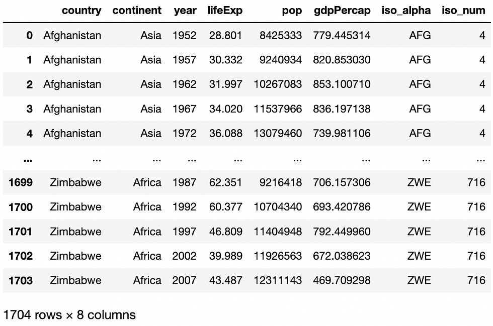
I’ve selected the gapminder dataset which returns a pandas DataFrame consisting of Country names, Continents and key indicators such as GDP per Capita and Life Expectancy across various years.
Prior to returning the dataset we should import the pandas library to perform data cleansing.
import pandas as pdYou can import these sample datasets using the data_package subpackage, the syntax is as follows.
px.data.gapminder()This will return the following Dataset.
I’ll give the dataframe a name by assigning it to the variable df.
df = px.data.gapminder()So as you can see from the above screenshot the data contains information for countries across a number of years. So each country will have a record for a number of different years.
General Syntax for Plotly Express Charts
px.scatter(data_frame, x, y, parameters)essential parameters include:
data_frame: this is the DataFrame
x: this is the x-axis variable
y: this is the y-axis variable
Note that not all visualizations require and x and/or y parameter. So let’s create a scatter plot with the following syntax. Click here to review the article for more information on scatter plots.
px.scatter(data_frame=df,x='lifeExp',y='gdpPercap')Adding an Animation Frame
You can add an animation frame using the animation_frame argument and assign a column to add as an animation frame. Each value of the column will result in a new frame, the values for the variables on each ‘frame’ will be plotted on the chart, creating an animation effect.
So if we add the year column to the animation_frame argument we will be able to display the gdpPercap vs lifeExp for each year.
px.scatter(data_frame=df,x='lifeExp',y='gdpPercap', animation_frame=’year’)
Note that the x and y range is unable to contain all of the data points, to change the range of the co-ordinate axis you can use the range_x and range_y arguments as follows.
px.scatter(data_frame=df,x='lifeExp',y='gdpPercap', animation_frame='year', range_x=[30,90], range_y=[-2000,60000])Adding an Animation Group
The animation_group argument takes a column and provides object-constancy across the animation frames. Matching groups will be treated as if they describe the same object in each frame.
So let’s add a color argument, and color each data point by continent.
px.scatter(data_frame=df,x='lifeExp',y='gdpPercap', animation_frame='year', range_x=[30,90], range_y=[-2000,60000], color='continent')Now let’s add country as animation group.
px.scatter(data_frame=df,x='lifeExp',y='gdpPercap', animation_frame='year', range_x=[30,90], range_y=[-2000,60000], color='continent', animation_group='country')Notice how each country is a data point. What happens if we change the animation group to continent.
px.scatter(data_frame=df,x='lifeExp',y='gdpPercap', animation_frame='year', range_x=[30,90], range_y=[-2000,60000], color='continent', animation_group=’continent’)Now the data points are reduced to just the continents. This is the effect of the animation group.
Adding additional arguments in your animated plot
You can add any other arguments that apply to your specific plot type to enhance the animation. So let’s add a size argument to our scatter plot, essentially turning it into a bubble plot, we can size the bubbles based on the population. This should really help bring the animation to life. Let’s also revert the animation group back to country.
px.scatter(data_frame=df,x='lifeExp',y='gdpPercap', animation_frame='year', range_x=[30,90], range_y=[-2000,60000], color='continent', animation_group=’country’, size=’pop’)Okay, so now let's make the final touches. Let's change the y-axis to a logarithmic scale using log_y=True, and set the maxiumum size of each bubble to 40 pixels by adding size_max=40.
px.scatter(data_frame=df,x='lifeExp',y='gdpPercap', animation_frame='year', range_x=[30,90], color='continent', animation_group='country', size='pop', log_y=True, size_max=40)Conclusion
Plotly Express is a great way to create interactive plots using only a single line of code. It allows for stunning publication ready visualizations with interactivity that is simply not available in any other libraries in Python to date.
Adding animation frames and groups can really enhance your visualizations and tell a story that shows changes over a period of time. This can be really impactful when used with the appropriate dataset.
Sources
Comments