Interactive Bar Plots in Python with Plotly Express
- Malvik Vaghadia
- Mar 12, 2022
- 4 min read
Updated: Mar 30, 2022
In this section
The Jupyter Notebook 'Bar Plots.ipynb' which is available in Github contains the code used in this article.
What is Plotly Express
Plotly Express is built on top of the Plotly library and can create figures with just a single line of code. Plotly is free and open source.
One of the main reasons why Plotly is such a great visualization library is because it provides interactive and beautiful aesthetics as well as a number of charting options.
Installation
Plotly Express is a built-in module from the Plotly library, so to be able to use Plotly Express you’ll need to install Plotly.
To install Plotly you can type either of the following in your terminal or command prompt:
pip install plotlyif you are using the Anaconda environment you can type:
conda install plotlyYou can import Plotly Express using the following line of code:
import plotly.express as pxThe syntax for any Plotly Express chart is:
px.chart(data_frame, parameters)Refer to the official guidance from Plotly here.
Note: I am using Jupyter Notebook as my preferred IDE but you can use other contexts such as Google Collaboratory, Visual Studio Code or even the Python Shell. Note that some other contexts might require a compatible renderer to be able to display your charts, refer to additional guidance in this instance.
Dataset Overview
As with other libraries in Python like Seaborn, Plotly has a number of built-in sample datasets.
I’ve selected the tips dataset which returns a pandas DataFrame consisting of data information about restaurant bills including the total bill, tip, sex, smoker flag, day of the week, time and size of the party.
Prior to returning the dataset we should import the pandas library to perform data cleansing.
import pandas as pdYou can import these sample datasets using the data_package subpackage, the syntax is as follows.
px.data.tips()This will return the following Dataset.
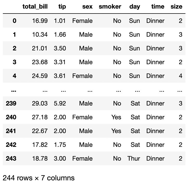
I’ll give the dataframe a name by assigning it to the variable df.
df = px.data.tips()Creating Bar Plots in Plotly Express (barplot vs histogram methods)
Bar Plots are useful for comparing multiple values across a categorical variable. The values are displayed as bars, the height of the bars is proportional to the value of each data point. The categorical variable is plotted against one axis and the data values are plotted against another axis.
There are a number of variations of bar plots - they can be plotted vertically or horizontally. There are also variations to bar plots such as stacked bar plots which allow you to look at numeric values across 2 categorical variables. Alternatively you can also display multiple bars in a grouped bar chart. We will explore all of these variations in this post.
The general syntax for creating a scatter plot using Plotly Express is:
px.bar(data_frame, x, y, parameters)Essential parameters include:
data_frame: this is the DataFrame
x: this is the x-axis variable
y: this is the y-axis variable
So let’s create our first bar plot:
px.bar(data_frame=df, x='sex', y='total_bill')In the code above I am using the tips data that I stored to the variable df. My categorical variable is ‘sex’ and the length of the bars is determined by the ‘total_bill’. Note by default the x-axis variable is the categorical variable and the y-axis variable is the numerical variable.
You can interact with the chart, try to hover over the data points and select an area of the chart to focus on.
In the chart above each line represents the division between each individual data point.
You can also create the bar plot using the Histogram method, the syntax is pretty much the same.
px.histogram(df, x='sex', y='total_bill')But you'll notice that there are no lines separating the data points.
One other different between using the histogram method compared to the bar method is that you can use different aggregation functions, the bar plot displays only the sum. Let's look at the average total_bill rather than the sum.
px.histogram(df, x='sex', y='tips', histfunc='avg')Grouped Bar Plots
You can create a grouped bar plot by using the barmode argument and specifying 'group'. This works on both the bar and histogram methods. To differentiate the bars you should also provide the color argument, the bars will be colored by the categorical variable provided in this argument.
px.bar(data_frame=df, x='sex', y='total_bill', color='day', barmode='group')px.histogram(data_frame=df, x='sex', y='total_bill', color='day', barmode='group')Stacked Bar Plots
You can create a grouped bar plot by using the barmode argument and specifying 'stack' (This is also the default behaviour if the barmode argument is omitted). This works on both the bar and histogram methods. To differentiate the bars you should also provide the color argument, the bars will be colored by the categorical variable provided in this argument.
px.bar(data_frame=df, x='sex', y='total_bill', color='day', barmode='stack')px.histogram(data_frame=df, x='sex', y='total_bill', color='day', barmode='stack')Orientation
By default the bars are vertical. You can align them horizontally by using the orientation argument and specifying 'h' in either the bar or histogram methods.
px.histogram(data_frame=df, x='sex', y='total_bill', color='day', barmode='stack')Conclusion
Plotly Express is a great way to create interactive plots using only a single line of code. It allows for stunning publication ready visualizations with interactivity that is simply not available in any other libraries in Python to date.
The bar plot is a great way to visualize data across multiple categories and allows you to add further categorical variables by extending the visualization to a grouped or stacked bar plot.
Sources:
Comments