Interactive Scatter and Bubble Plots in Python with Plotly Express
- Malvik Vaghadia
- Mar 7, 2022
- 3 min read
Updated: Mar 30, 2022
In this section
The Jupyter Notebook ‘Introduction to Scatter Plots and Bubble Plots.ipynb’ which is available in Github contains the code used in this article.
What is Plotly Express
Plotly Express is built on top of the Plotly library and can create figures with just a single line of code. Plotly is free and open source.
One of the main reasons why Plotly is such a great visualization library is because it provides interactive and beautiful aesthetics as well as a number of charting options.
Installation
Plotly Express is a built-in module from the Plotly library, so to be able to use Plotly Express you’ll need to install Plotly.
To install Plotly you can type either of the following in your terminal or command prompt:
pip install plotlyif you are using the Anaconda environment you can type:
conda install plotlyYou can import Plotly Express using the following line of code:
import plotly.express as pxThe syntax for any Plotly Express chart is:
px.chart(data_frame, parameters)Refer to the official guidance from Plotly here.
Note: I am using Jupyter Notebook as my preferred IDE but you can use other contexts such as Google Collaboratory, Visual Studio Code or even the Python Shell. Note that some other contexts might require a compatible renderer to be able to display your charts, refer to additional guidance in this instance.
Dataset Overview
As with other libraries in Python like Seaborn, Plotly has a number of built-in sample datasets.
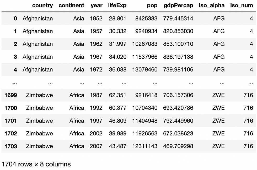
I’ve selected the gapminder dataset which returns a pandas DataFrame consisting of Country names, Continents and key indicators such as GDP per Capita and Life Expectancy across various years.
Prior to returning the dataset we should import the pandas library to perform data cleansing.
import pandas as pdYou can import these sample datasets using the data_package sub-package, the syntax is as follows.
px.data.gapminder()This will return the following Dataset.
I’ll give the DataFrame a name by assigning it to the variable df.
df = px.data.gapminder()The dataset contains data across a number of years
df[‘year’].unique()
I’ll reassign df to include only those records where the year Is 2007 using the following code:
df = df[year]==‘2007’Creating Scatter Plots in Plotly Express
The scatter plot helps you understand the relationship between two numeric variables for a set of data and showing the correlation, this is its primary use. A scatter plot can also be useful in identifying patterns in your data or show any unexpected gaps.
It typically uses dots to display data points, the position of each dot on the horizontal x-axis and vertical y-axis indicates the value for a single data point.
The general syntax for creating a scatter plot using Plotly Express is:
px.scatter(data_frame, x, y, parameters)Essential parameters include:
data_frame: this is the DataFrame
x: this is the x-axis variable
y: this is the y-axis variable
So let’s create our first scatter plot:
px.scatter(data_frame=df, x=’gdpPercap’, y=lifeExp’)In the code above I am using the gapminder data that I stored to the variable df, I’m analysing the lifeExp vs gdpPercap as you can see from the x and y parameters.
You can interact with the chart above, try to hover over the data points and select an area of the to focus on.
If you want to add a bit of colour to our chart. We can colour the chart by using the color argument in our scatter method, I’ll colour each data point depending on the continent it belongs to.
px.scatter(data_frame=df, x=’gdpPercap’, y=lifeExp’, color=’continent’)Creating Bubble Plots in Plotly Express
A bubble plot builds on from a scatter plot and allows you to analyse a 3rd variable. This variable impacts the size of each dot.
To create a bubble plot you simply add a size argument and specify the variable that you would like to determine the size of each dot.
So let’s extend the previous visual to size each dot by the population of each data point (Country). You do this by specifying the size argument and the name of the column as follows:
px.scatter(data_frame=df, x=’gdpPercap’, y=lifeExp’, color=’continent’, size=’pop’)You can also use the size_max argument to set the maximum mark size. By default it's set to 20 pixels. Let’s change it to 60.
px.scatter(data_frame=df, x=’gdpPercap’, y=lifeExp’, color=’continent’, size=’pop’, size_max=60)Conclusion
Plotly Express is a great way to create interactive plots using only a single line of code. It allows for stunning publication ready visualizations with interactivity that is simply not available in any other libraries in Python to date.
The scatter plot is a great way to visualize the correlation of two numerical variables at the same time and adding a third variable is an efficient way of differentiating between values.
Sources:
コメント